|
| Topic |
|---|
| Plot Workbench |
| Level |
| Beginner |
| Time to complete |
| Author |
| FreeCAD version |
| Example File(s) |
In this tutorial we will learn how to perform a basic plot using Plot module and Python console. You can learn more about Plot module here.
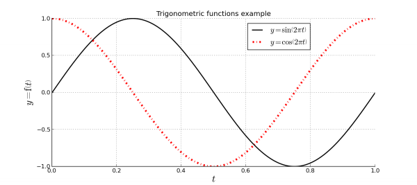
In previous image you can see the result that we aproximately will obtain. Following this tutorial you will learn:
- How to create a Plot from Python Console.
- How to plot some data from Python Console.
- How to show the grid lines.
- How to show the legend.
- How to edit series labels, introducing text in LaTeX.
- How to edit axes labels, introducing text in LaTeX.
- How to edit series styles.
- How to save your plot.
Plotting data
In order to plot data you don't need to create a new FreeCAD document, simply show the Python console and start sending commands, or use macros.
Creating plot document
Plots are special documents that can be created manually in order to add data later, or allow the module creates one authomatically when you start plotting data. Create your own plot documents have 2 advantages:
- You can set the document window label.
- You can control easily on wich document you plot your data.
In order to create new plot document simply launch following commands:
import Plot
Plot.figure("TrigonometricTest")
That will create a new tab on main windows called TrigonometricTest. The new created document already have a set of axes. Each plot document have at least one set of axes that can be removed without using fully matplotlib control.
Drawing functions
You can start working here due to plot command will start a new document, but all plot commands that you execute will append series to created plot until you don't create a new document, so ussually is better options control the opened plot documents. First thing that we need to do is create the data for sine and cosine functions that we want to plot:
import math
t = range(0,101)
t = [tt/100.0 for tt in t]
s = [math.sin(2.0*math.pi*tt) for tt in t]
c = [math.cos(2.0*math.pi*tt) for tt in t]
That will create 3 arrays of data (with 101 points):
- t = Time in seconds.
- s = Sine function.
- c = Cosine function.
In order to plot both function we only need to launch next commands:
Plot.plot(t,s)
Plot.plot(t,c)
That will plot our functions. plot command allows the series label as argument, but since we will edit it later using Plot module tools we don't pass this data yet.
Configuring plot
Showing grid and legend
Change FreeCAD workbench to Plot module in View/Workbench menu. When module has been loaded use grid tool in order to show it.
You can repeat the action in order to hide it. Also you can show the legend with the tool provided.
As you can see, legend is empty because we have not set any series label yet. In Plot module series without label are not represented at legend, in order to allow you to draw auxiliar lines.
Setting series labels
With the series tool you can edit some series parameters.
First for all select the line that you want to edit, for example we will start with the first one. Uncheck No label and set this label:
$y = \sin \left( 2 \pi t \right)$Since matplotlib supports LaTeX you can set all the labels or titles that you want using it. Set the following label to second serie:
$y = \cos \left( 2 \pi t \right)$Setting series style
Series allows you to set a lot of series properties. Try to set the properties shown at the example image, changing series colors and drawing style of the second one.
Setting axes labels
With the labels tool you can set labels associated to all created axes.
Set this data:
- Title = Trigonometric functions example
- X Label = $t$
- Y Label = $y = \mathrm{f} \left( t \right)$
Also change the size of all of them to 20.
Saving plot
With saving plot tool you can save your plot as image file in several formats.
First for all select the path of the output file. You can use file selection dialog using the button at right of the path edition line.
You can set the output image size in inches, for example we can set 11.7x8.3 that is a DIN A4 paper size. DPI (Dots per inch) will control the image resolution, for example using 100 dpi you will get an image of 1170x830 pixels.


